


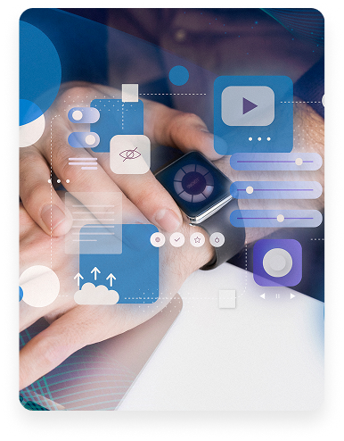
Mobile-centric design: Why it’s more important than ever!
Mobile-centric design: Why it’s more important than ever!
Introduction to Mobile-First Design
In today’s digital world, mobile devices have become the primary way people access the internet. Users expect fast, intuitive, and seamless experiences on their smartphones. This shift has made mobile-first design not just a trend, but a necessity for modern digital products.
What Is Mobile-First Design?
Mobile-first design is an approach where designers start by creating experiences for smaller screens before scaling up to tablets and desktops. Instead of shrinking desktop layouts, the focus is on prioritizing essential content and functionality for mobile users from the beginning.
The Rise of Mobile Usage
Mobile usage has surpassed desktop browsing across most industries. People use their phones for shopping, learning, social interaction, and work. This change in behavior means businesses must adapt their design strategies to meet users where they are—on mobile.
How Mobile-First Improves User Experience
Designing for mobile first forces clarity and simplicity. It helps eliminate unnecessary elements, improve navigation, and ensure faster load times. As a result, users enjoy a smoother and more engaging experience, which increases retention and conversions.
Mobile-First Design and SEO Benefits
Search engines prioritize mobile-friendly websites in their rankings. A mobile-first approach improves page speed, usability, and accessibility—all key factors for SEO. Websites designed with mobile in mind are more likely to rank higher and reach a broader audience.
Key Principles of Mobile-First Design
Successful mobile-first design relies on several principles: clear visual hierarchy, touch-friendly interactions, optimized performance, and responsive layouts. Content should be concise, readable, and easily accessible on small screens.
Common Mistakes to Avoid
One common mistake is overcrowding mobile screens with too much content. Another is ignoring performance optimization, which leads to slow loading times. Designers should also avoid relying solely on desktop interactions that don’t translate well to touch-based devices.
The Future of Mobile-First Design
As technology evolves, mobile-first design will continue to shape digital experiences. With advancements like 5G, AI, and wearable devices, designing for mobile will remain at the core of user-centered design strategies.


Ahmed seirag
I ordered from Strevya and I’m really happy with the quality and how fast my order arrived. Great customer service and beautiful products! Will definitely shop here again.

admin
I ordered from Strevya and I’m really happy with the quality and how fast my order arrived. Great customer service and beautiful products! Will definitely shop here again.

Salma Abbas
Excellent shopping experience! Fast delivery and amazing products. Highly recommend Strevya to everyone

Ahmed sei
I ordered from Strevya and I’m really happy with the quality and how fast my order arrived. Great customer service and beautiful products! Will definitely shop here again.